
How to Strategically Use Color in Website Design – A Detailed Tutorial

Intentionally using color in website design is essential. This is because color evokes emotion and meaning at a subconscious level. When strategically used, color is a tool that can create brand recognition and communicate a brand’s message.
A Detailed Tutorial on How to Strategically Use Color in Website Design
It is more than just aesthetics when selecting a color for the design of a website. It is important to understand color harmony, psychology, and theory before creating a website. Understanding these elements will ensure that you create an effective color palette for a website.
From there, creating palettes that go well with the brand’s messaging, values, and target market become easier. Below are more details on how to strategically use color in website design.
1. Consider cultural context
On an individual level, different colors have different meanings. At the same time, certain colors have deep-rooted cultural meanings. For example, red in Western culture is an attention-grabbing color. It signifies urgency and danger. This is not the case in Eastern cultures. Red represents luck in places like India and China.
Furthermore, white is the color of mourning and death in some Eastern cultures. In western cultures, the analogous color is black. Context is essential when selecting color as illustrated by the examples stated. The color you use in the design of a website will send different messages. This also depends on the location of the brand’s target market.
Therefore, you should know which colors to avoid or include based on the target market of the client. You can Google-search the cultural color context to help you with this. However, you should avoid using red color with deep cultural significance especially if a brand targets a global market.
We are averse to certain colors but we may not consciously realize it. There are exceptions still. The signature brand color universally known to the Coca-Cola Company is red. The recognition in this case that is associated with the color of the brand is powerful enough to overshadow any negative Western connotations of the color red.
2. Understand color theory

The color theory is a set of basic principles. These principles govern how to create color combinations that harmonize. The first step to creating great color palettes for websites and brands is by understanding these principles. A color wheel is a great tool for understanding the fundamentals of color theory.
There are variations in the color wheel. Among them are primary colors, secondary colors, and tertiary colors. The three primary colors are blue, yellow, and red. Combining two primary colors will form secondary colors. The secondary colors are orange (red + yellow), green (blue + yellow), and purple (red + blue). Combining primary and secondary colors form tertiary colors.
Color contrast is another important element of color theory. Two colors will stand out more from each other if their contrast is higher. It is important to consider colors and their tones when evaluating contrast. You cannot get a high contrast from two different colors having even tones. The difference in contrast between the two colors will be more apparent when you convert them to grayscale.
In designing a website, you should understand that contrast makes certain elements stand out visually. However, the contrast should not be much. This is because having too much color contrast on a website can wear out the eyes.
3. Use color psychology
Color psychology is the influence color has on our behaviors, emotions, and feelings. This influence is a bit subjective and it can meaningfully impact people who visit a website. Color psychology is a powerful tool for marketing and design. This is because colors spark emotions.
In designing a website, you must remember that people are drawn to particular colors because of how it makes them feel. In contrast, can also lead to someone avoiding a website because of how it makes them feel. In context, red is a color that might cause some people to feel anxiety and fear. It could incite excitement and passion in another context.
You must consider the elements of a website page if you need to use color to convey emotions. Examples of such important elements are imagery, typography, and copy. With this, you can use colors that align with the message you intend to pass across.
Below are some color associations you must consider in web design.
- White: cleanliness, clarity, peace, purity
- Black: depression, sophistication, control, power, elegance
- Brown: support, protection, security, nature
- Pink: warmth, sincerity, gentleness, nurturing
- Purple: creativity, loyalty, sophistication, mystery, luxury
- Orange: playfulness, comfort, warmth, freedom, fun
- Yellow: friendliness, creativity, optimism, happiness
- Green: prosperity, abundance, nature, health
- Blue: reliability, logic, peace, competence, trust, calm
- Red: excitement, danger, love, power, passion
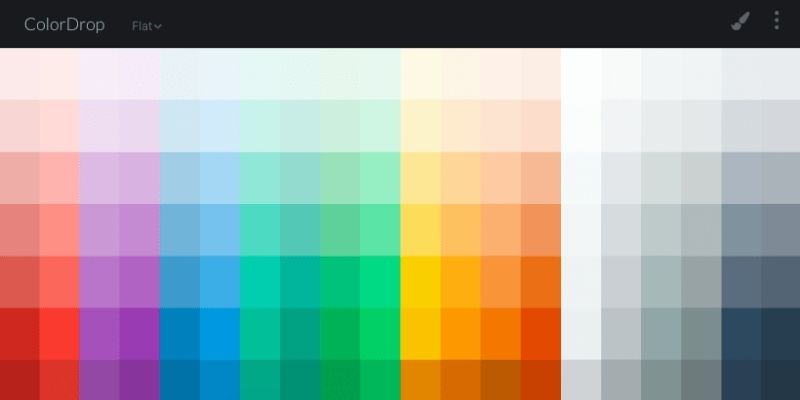
4. Create a color palette
You will be well-equipped to create a purposeful color palette for a website after understanding the fundamentals of color theory and psychology. The brand’s main color should be the first color you choose. This is where the significance of color psychology becomes more profound.
Let’s take the Coca-Cola Company for example. The primary color of this brand is vibrant red. It is a color that is all over their advertising and website. White and black are the only other colors in their palette and these colors are used for text. The color red associates Coca-Cola with warmth, love, and feelings of excitement.
There are five major types of color palettes you can select from. They are complementary, split complementary, triad, monochromatic, and analogous. You can use any of these palettes in the design of a website. With added creativity, you can have an effective color palette.
Conclusion
Color is an important factor to consider when designing a website. You can strategically use them in the process. Following the fundamentals of color theory and psychology will help you create an impactful color palette when designing a website. However, color is not all of it. You must be able to combine color principles with the layout, typography, and UX of the website.


No comments, be the first one to comment !